Thursday, December 8, 2011

Visual Techniques


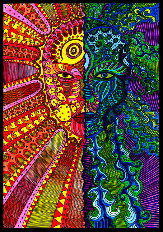
Source: http://vega0ne.deviantart.com/art/VEGAONE-DE-2008-74572058?q=boost%3Apopular%20in%3Adesigns%2Fweb&qo=17
Visual Techniques:
-Contrast
-Complexity
-Active
-Instability
-Irregularity
-Variation
-Depth
-Opacity


Source: http://jk89.deviantart.com/art/Imago-62914298?q=boost%3Apopular%20in%3Adesigns%2Fweb&qo=3

Visual Techniques:
-Simplicity
-Unity 
-Statis
-Consistency
-Balance
-Flatness


The two posted designs above are related to my area of interests, Visual Communications, and especially related since it is website design. The designs are related because both are trying to get information across to the target audience, however they differ in the way the information is structured to do so. In the first website the designer uses techniques like irregularity and variation. The designer used a bunch of different designs and combined them together in a type of collage. This is different from the second image because of its use of consistency and unity. All related information is in the same square and all the squares are connected together to make a rectangle. The first image also uses depth and opacity to give the design a feeling of dimension. Numerous things are covering other designs giving it the 3D type feel. The second is flat and there is no opacity, everything is just to next to each other. The first design uses complexity is activeness versus simplicity and stasis like the second. Both designs are able to convey the information across to the reader, however they differ in the fact that the first chose to use a more extravagant, crazy style while the second chose to go with the more professional & simple look. 

Wednesday, November 30, 2011

Contrast

Source: http://shurka.deviantart.com/art/the-contrast-31350543?q=boost%3Apopular%20contrast%20color&qo=1

The design above is an example of using contrast in a successful manner. The contrast in hue represents the two different emotions that the image is trying to portray. The left side of the image has a warm, happy, positive feeling to it, and even could be interpreted as the sun. The right side of the image is more negative and mysterious. The green could represent envy, while the blue could represent the mysteries of the sea. The purple and black also add to this mysterious and scary feel. The technique used in the making of this design was to reflect two opposites combined as one, representing two different moods. The reader is able to compare the differences and understand the overall meaning of the design. Without the use of color contrast in this design the reader would not easily be able to tell the difference between the sides. If the whole image only contained the colors blue, purple, green, & black the reader would not be able to see the positive emotion of the image.

Source: https://blogger.googleusercontent.com/img/b/R29vZ2xl/AVvXsEicWDp1Q-kQRftiUJjYkh8qWbitY1zD934xIsDk492lCnrE8faPPa1uK5RW8q9lh5lA_9XQVj0XtvlRJKV43Iaezu9aQrSUyS8PkEGMHZaL4kZNiACGq1Fxwaa3H7YkBDD97paPW5KEuWE/s1600/bad+site.png

The webdesign above demonstrates a poor use of contrast and leads to a failed design. The contrast in hue and saturation throughout the site is horrible. The designer tries to make to many things stand out at once making the reader confused at what they should look at first. For example, the letters A-Z stand out because of the bright green behind them, but the letters are the least of importance compared to everything else on the website. Furthermore, the improper use of contrast makes the website appear to give more importance to the Democratic Party because of how much blue there is compared to red. However, the website actually is for both parties, giving neither one more importance. The designer should of used less colors and made the overall theme of the website similar colors and have what is really important in bright colors. There is also poor contrast in terms of shape. The website has so many different sized squares and rectangles that nothing stands out. Because of the designer's improper use of contrast, the design is an ultimate fail.

Thursday, November 17, 2011

Movement/Motion - Implied Motion


The image above represents implied motion in design of a person running away from gunshots. For one, Gestalt's Law of Continuation means that we expect for the lines coming from the bullets to continue. Therefore, the bullets are implied to be moving forward as well. Even though this picture is frozen, we understand it as motion because of our knowledge of what running looks like. Also, because of prior knowledge of the world we know that the bullets will continue to go in the direction they are already in. Bullets do not shoot and then randomly change direction. The man's hair is also blown back because of the force of running against the wind representing motion. Lastly, the artist uses Dondis Guidelines for balance and imbalance to represent this implied motion. One leg is up in the air and the other is out in front on the ground. By looking at this design we understand that this legs we continuously be opposite from one another, which represents running.


The movement implied in this design is what makes this design so intriguing to look at. This designed sculpture has a spiral effect and because of Gestalt Law of Continuation we expect this spiral to continue representing motion. This design also has an abstract side to it, where it appears that many of the pieces should be falling in various directions. The designers use of direction can be also be seen. Each piece of the sculpture is slanted in a certain way and implies that it should continue to fall in that direction. There is also implied motion because of the cutouts from the pieces. It appears as if there are two spirals right next to each other. The cutouts could be compared to something like a snake that is slithering through the ground leaving a trail of its path. Thus, implied motion can see be in this object in several ways from the spiral continuing to go upward to each piece implying that it is about to fall to the direction of its slant.

Thursday, November 10, 2011

Dimension/Depth/Space/Scale

 Source: http://adverka.deviantart.com/art/depth-21899593?q=boost%3Apopular%20Depth&qo=49

 The image above relates to my area of interests and planned major because it is a picture taken in San Francisco and the picture contains multiple size and depth perception cues. For starters, overlap can be seen by looking at how some of the polls are on overlapping the polls behind them. They also overlap the background giving them the visual perception that they are in front of those objects. Another element of depth perception that can be seen is texture gradient. The dirt and rocks on the ground get smaller towards the background and lose all detail and thus, look almost like a plain color. Linear perspective is also in this picture and can be seen by looking at the roof. The parallel lines on the roof converge as they get further away. Lastly, the image has dimension. This visual perspective can be seen by the shape of all the objects in the image, giving it a tunnel feel and if the image was to continue in the background everything would come together to a vanishing point.

Thursday, November 3, 2011

Tone & Color

Source: http://cyzra.deviantart.com/art/Character-Design-No-64-251149732?q=boost%3Apopular%20design&qo=141

I chose this character design as my example for tone and color because both these features are important elements in how this design operates. This design is an example of the juxtaposition of tone, which Dondis in A Primer of Visual Literacy describes as "the intensity of darkness or lightness of anything seen". The variations of light in this picture is what gives it its meaning. The darkness used for this design give it a darker and more evil feeling. The designer also made use of tone by making everything dark except for what he felt important. The light behind the character represents the importance of the character and the fire represents evil.Tone is also interacting with texture because of the design of fire's reference to the reality of fire. 

Color, as an important element, is operating in this design through the use of the colors red, yellow, and orange. These are used because of the symbolic meaning that they have. Red is the color of fire and blood and thus, is used here to signify danger, power, anger etc. The dark orange represents deceit and distrust. Yellow, the color of sunshine, can be associated with intellect and energy. All these colors together give a combined meaning of a dangerous, powerful, intelligent character. All these colors are associated with emotions and since we are human we are able to understand them. Because of the black background, all these colors stand out even more and add more meaning to the overall design representing the "pop-out effect". According to Jane Veeder's lecture, "color perception is highly dependent upon context and contrast with other colors". If the background of this image was not black, but a color on the yellow-red scale, it would not have the same strength of meaning attached. Movement is another one of Dondis elements that can be observed in association with color. Behind the character the color is yellow and as the you go further out from the character the color gets orange and then dark orange. The color represents that the character is moving forward away from the light source. Color, tone, texture, and movement are all working together in this design to give maximum meaning to the observer.

Tuesday, October 25, 2011

Blog Exercise - The Basic Elements (Web Design)

Web Design - The Basic Elements
http://html5readiness.com/
MOVEMENT

The web design pictured above is a perfect example of one of the Dondis Basic Elements; movement. Movement can be observed from the image above by the different colored dotted lines shooting outward. It gives the impression that they are shooting outward away from the middle bottom of the design towards future development. It is using change, sequence, and progression to reflect its results. For example, change can be seen by going to the website and putting your mouse over one of the lines on the bottom middle of the page and see which browser is capable of what and when. Progression can be seen by clicking the different years and see the advancements each browser has made. Lastly, sequence can be seen by looking at how every browser advanced every year. The role of movement in this web design is to show each browsers advancements over the years and in what areas. Thus, when the reader experiences this design they are able to understand the overall progress in all the different areas of browser advancement.
http://ntt.cc/2010/08/13/40-amazing-fresh-good-design-html5-websites.html
TEXTURE

This web design is an example of texture, another one of Dondis Basic Elements. The design of this website makes use of texture with the background image. The mountains, orange and green smudge, and fog removes the flatness of a design and gives it an interesting and realistic feel. By removing the flatness, the website is then given depth and an intriguing look. It gives an illusion and feeling that you are outside looking at this mountain in foggy weather. The texture of this design gives the whole website an outdoor mountain feel because no matter what part of the website you go to, you still see the background image. It tells a lot about the purpose for the website. The role of texture in this design is to give a more realistic feeling to the website. If the reader went to this website to research information about outdoor activities, they would trust the information coming from this website more than a website without the texture because of the realistic feeling the texture gives.

http://www.kerve.co.uk/
SCALE

 Another one of Dondis basic elements can be seen in the design above; scale. Scale, which is a measuring tool, is used in this design with typography and the different text sizes of the various words. The designer obviously gave the bigger font sizes to the words that he wanted to have more importance. The designer's choice in using different font sizes, styles, and positions gives the web site a more effective and powerful meaning. The role of scale in this design is to give certain words more significance than others but still include a lot of information at the same time. The reader will see the bigger texts first and understand some key words about the website's message and then if interested will look further at the smaller words and get a more overall understanding of the website.

Thursday, October 20, 2011

Visual Thinking Research

 The first puzzle my roommate and I completed can be found here: http://www.puzzles.com/PuzzlePlayground/NextSquare/NextSquare.htm

My attempt:
 Roommate's attempt:

When solving these puzzles my roommate completed his almost right away while it took me a couple minutes to solve and I didn't even end up being correct. My method at solving this puzzle was to use pattern seeking. I tried to find some pattern between the squares and what I came up with was that the first and third box had one line and the second and fourth had two lines so I figured that the question mark box ha to be C considering the fact that it was the only answer box with one line. This didn't seem like a very likely pattern, but I couldn't figure out anything else that seemed to work. My roommate on the other hand got his answer right away because he looked at the overall picture first. He noticed that the lines in each square actually made up a number and each box was the next number; 1, 2, 3, 4, 5. In this way he was using from another viewpoint because numbers are not normally seen in this way. He also used pattern completion because he saw the number pattern and was able to complete it successfully.

 The second puzzle my roommate and I completed can be found here:http://www.puzzles.com/PuzzlePlayground/ThreeBracelets/ThreeBracelets.htm

 My attempt:


Roommate's attempt:

With this puzzle both and me and my roommate finished around the same time and both of us got the correct answer. In my completion of the puzzle I used matching and rotation. I rotated the paper so I could look at all three circles from the same angle and noticed that one of the triangles was facing the wrong direction and therefore did not match. My roommate also used matching but his method was different. He started at the same shape on each figure and then moved his finger one by one to the next shape on all figures and realized that after doing this a few times one of the triangles was backwards.

Thursday, October 13, 2011

Visual Perception 2 / Feature Hierarchy

Source: http://www.skinniemagazine.com/articles/coachella-valley-music-arts-festival-announces-2010-line-up/


        The poster above relates to my area of study, Visual Communication Design, and my interests because I like designing posters and I also like attending the actual festival. The poster is for a festival called Coachella which takes place over three days in Indio, California. It relates to the feature channels in several ways as well. When looking at the image, the first thing your eyes are directed to are the words Coachella, Jay-Z, Muse, & Gorillaz because of the size of text. After reading each headliner the poster plans your eye movement to look at all the bands below. The smaller the text for each band represents the less of importance. The color of the poster represents that the event takes place in an outside setting far away from any city. The colors also give off a soothing, friendly feel. The three different sections of text represents grouping, for each section illustrates the different artists performing that day. The layout feature channel is also present and is being used to show the order of days and what each day includes.The poster as a whole is organized very well, and makes it very easy for the reader to make sense of what this event is all about and what will happen when. Even though this poster is professionally designed,I would love to have the opportunity to design a poster for this event to illustrate how I can use the feature channels in an even better way to get their message across.

Thursday, October 6, 2011

Visual Perception 1 / Top-Down Visual Processing

Source: http://knakmos.deviantart.com/art/Perception-23682233

My area of study is Visual Communication Design and it relates to this design because Visual Communication Design uses various play on words, whether it be in an advertisement or artistic creation, to give off certain meanings. The image above is an example of top-down visual processing because it is related to goal-biased attentional looking. At a first glance of the image one would first see a vast amount of random letters getting the overview of the design. However, after that first glance longer fixations occur and the image directs ones eye movements to the letters in red. A person's eye movements begin at the word "everything" and then go down to the word "is" and this patterns continues until the person reads the last word in red, "perception". The words are then linked together in a person's mind to say "everything is a matter of perception". Thus, the purpose or goal of this design is to direct one's eye movements from one red word to the next to get the overall message of the design.

Thursday, September 29, 2011

Design Success and Failure in Relation to Syntactical Guidelines


This blog is an example of design success because the Syntactical Guidelines that have been put to use help the targeted user understand the site. For example, balance can be seen here in its vertical and horizontal construction. The site flows very well and is easy to comprehend because of this. Balance as functionality can also be seen because each box on the page has a direct purpose; to separate the various information on the page, and at the same time all the boxes contribute to the overall balance of the website design.

Furthermore, stress can also be seen here in the artist section of the blog. Some of the names are bigger than others because the website owner wants certain names to stand out more than others. Leveling can be seen here a well because the site overall has balance and harmony. Everything flows with each other, and there aren't certain sections that are causing more tension.

Finally, grouping is also implemented in this blog and can be observed by just looking at the different sections on the page, such as artists, interviews, buy music, etc, and seeing how all related items are grouped together.


This website is an example of failure in relation to Syntactical Guidelines because it leaves the user confused and unsure of what to click on. There is no clear guide to the website and everything is just kinda all over the place. In terms of Syntactical Guidelines, stress is being used but in a poor way. The designer gave stress to to many different things on the page giving it no sort of balance but in fact the opposite. Grouping is also attempted but is not successful in helping the user navigate the page. For example, helicopters are next to each on some parts of the page, but then they are also on other parts of the page. The designer should of put all the helicopters together, not just some of them. This website is a mess and even though there was an attempt to follow some of the Syntactical Guidelines, the designer was not able to do this in a successful manner in terms of the user understanding the website.

Wednesday, September 21, 2011

Visual vs Symbolic Language

Unemployment.

One-word or short-phrased responses in terms of its literal, representational content, underlying compositional structure and symbols:

Crowded. Depression. Long line just to get something for free. Sorrow. What people are wearing. Dressed nicely. Free soup. Waiting. Bad times. Inflation. Hard times. Reality of the depression and unemployment. Free coffee & donuts for unemployed. No jobs. A lot of people in the same situation. People don't care time in line with be long because they have no other choice. Black and white. Unfortunate.

This photograph represents a lot of people in line during the Great Depression. They are all in line to get free donuts, coffee, and soup. All the people in line do not look happy, but they give off this look that there is nothing they can do about it. They are all dressed nicely meaning they were probably looking for work that day and had no luck, so they have to go somewhere where they get food and drinks for free. Everything looks bland and there is no real sign of happiness. The way they are standing symbolizes no hope for work and there is there only option for food. If someone was visually impaired, I would describe it as a lot of people in a huge line waiting to get into this coffee shop to get free coffee, soup, and donuts. The people are dress nicely and still don't have work and all have a sense of sorrow on their faces.

Thursday, September 15, 2011

Meaning 2: Interactions Between the 3 Levels

When observing this image one can quite clearly see that the representational part of the image is the sphinx itself. It is clearly representational of a sphinx because of the strong visual details. The impact that it gives to the viewer is that is indeed the mythical creature, a sphinx. This level of representation relates to abstraction because it is made out of stone that is decaying and has pieces that are broken off. However, even though pieces are missing the nature of abstraction makes it possible for the observer to understand the monument and its meaning. It gives off a direct message of power because of its size. It is also abstract because sphinxes were often used for royal tombs and religious temples and one would not know this just from looking at it. This relates to the symbolic level because people understand this mythical creature from myths of Egyptian & Greek tradition. The sphinx combines different forms in one; haunches of a lion, and head of man. These combined human and animal parts are symbols, the lion symbolizes the sun and power. The head is a great pharaoh and the lions body makes his image look extremely powerful.  They also understand that is symbol of characteristics such as wealth, intelligence. It is a wonder of the world and that alone makes it a symbol of great awe. In conclusion, it is representational because it is clearly a sphinx, abstract because it is place for royal burial and religious worship on the inside, and symbolic because of the combination of human and body parts and the fact that is symbolizes power.

Thursday, September 8, 2011

Meaning - Representation, Abstract, Symbol

Representation 
This image is representation because its perception links to our memory of what we consider a dog. This dog is part of a broader category but can also fit into a smaller category for there are many different types of dogs. Depending on a person's knowledge and experience the dog will have varying levels of categorization. This image is also considered representation because it carries so much information and is so realistic. Because this image is a photography is the most dependable means of representing visual reality. When seen by a viewer they automatically will think dog because that is what their visual perception is trained to do. It is so realistic that the viewer doesn't even wonder if it is a dog, it just is.

Abstraction
This image represents abstraction for the process of distillation takes place, where what stands out is the cross and the buildings are basically forgotten. This process emphasizes and gives far more significance to the lighted area, which represents the cross. The visual information from this picture is more representational therefore its reference is more specific. Abstraction from this photo derives from a cross, thus representing more of a religious abstraction. Human perception of this image automatically removes surface detail because of the human need to have a visual balance. When one sees this abstract picture they automatically think cross and not building tops in the sky.

Symbolism
This image is an example of Symbolism because it is expressing and communicating through coded forms. People know that this sign denotes danger. The skull and cross bones symbolize danger and caution. Even if a person had never seen this sign before a sense of danger would still come over to them because of intimidating look. This image is also symbolism because of the reduction of visual detail to a minimum. People around the world understand the coded message behind this symbol because of its representation.