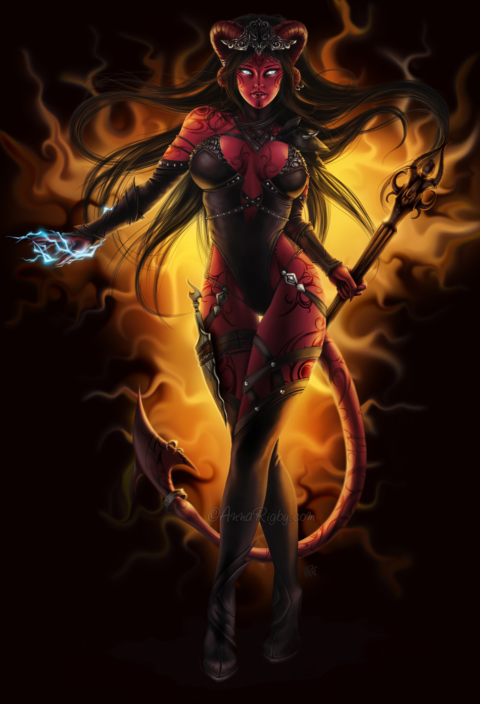
I chose this character design as my example for tone and color because both these features are important elements in how this design operates. This design is an example of the juxtaposition of tone, which Dondis in A Primer of Visual Literacy describes as "the intensity of darkness or lightness of anything seen". The variations of light in this picture is what gives it its meaning. The darkness used for this design give it a darker and more evil feeling. The designer also made use of tone by making everything dark except for what he felt important. The light behind the character represents the importance of the character and the fire represents evil.Tone is also interacting with texture because of the design of fire's reference to the reality of fire.
Color, as an important element, is operating in this design through the use of the colors red, yellow, and orange. These are used because of the symbolic meaning that they have. Red is the color of fire and blood and thus, is used here to signify danger, power, anger etc. The dark orange represents deceit and distrust. Yellow, the color of sunshine, can be associated with intellect and energy. All these colors together give a combined meaning of a dangerous, powerful, intelligent character. All these colors are associated with emotions and since we are human we are able to understand them. Because of the black background, all these colors stand out even more and add more meaning to the overall design representing the "pop-out effect". According to Jane Veeder's lecture, "color perception is highly dependent upon context and contrast with other colors". If the background of this image was not black, but a color on the yellow-red scale, it would not have the same strength of meaning attached. Movement is another one of Dondis elements that can be observed in association with color. Behind the character the color is yellow and as the you go further out from the character the color gets orange and then dark orange. The color represents that the character is moving forward away from the light source. Color, tone, texture, and movement are all working together in this design to give maximum meaning to the observer.
No comments:
Post a Comment