Wednesday, November 30, 2011

Contrast

Source: http://shurka.deviantart.com/art/the-contrast-31350543?q=boost%3Apopular%20contrast%20color&qo=1

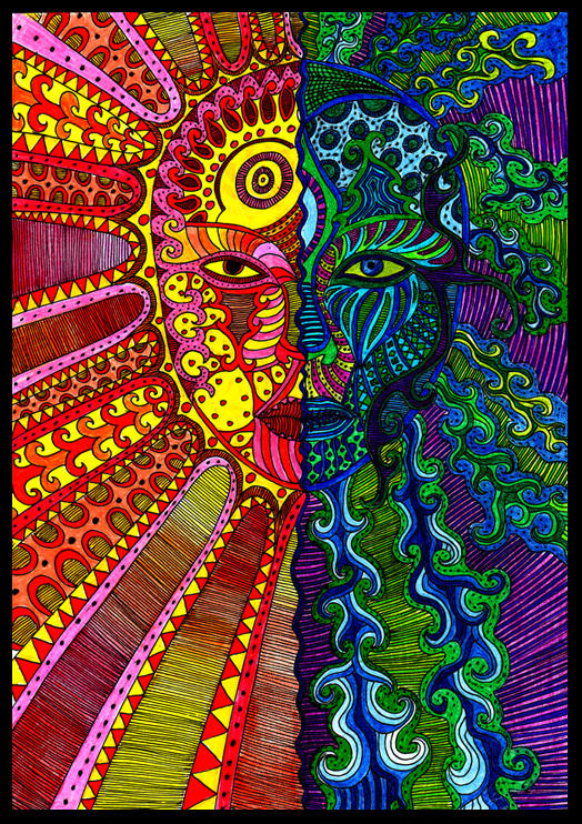
The design above is an example of using contrast in a successful manner. The contrast in hue represents the two different emotions that the image is trying to portray. The left side of the image has a warm, happy, positive feeling to it, and even could be interpreted as the sun. The right side of the image is more negative and mysterious. The green could represent envy, while the blue could represent the mysteries of the sea. The purple and black also add to this mysterious and scary feel. The technique used in the making of this design was to reflect two opposites combined as one, representing two different moods. The reader is able to compare the differences and understand the overall meaning of the design. Without the use of color contrast in this design the reader would not easily be able to tell the difference between the sides. If the whole image only contained the colors blue, purple, green, & black the reader would not be able to see the positive emotion of the image.

Source: https://blogger.googleusercontent.com/img/b/R29vZ2xl/AVvXsEicWDp1Q-kQRftiUJjYkh8qWbitY1zD934xIsDk492lCnrE8faPPa1uK5RW8q9lh5lA_9XQVj0XtvlRJKV43Iaezu9aQrSUyS8PkEGMHZaL4kZNiACGq1Fxwaa3H7YkBDD97paPW5KEuWE/s1600/bad+site.png

The webdesign above demonstrates a poor use of contrast and leads to a failed design. The contrast in hue and saturation throughout the site is horrible. The designer tries to make to many things stand out at once making the reader confused at what they should look at first. For example, the letters A-Z stand out because of the bright green behind them, but the letters are the least of importance compared to everything else on the website. Furthermore, the improper use of contrast makes the website appear to give more importance to the Democratic Party because of how much blue there is compared to red. However, the website actually is for both parties, giving neither one more importance. The designer should of used less colors and made the overall theme of the website similar colors and have what is really important in bright colors. There is also poor contrast in terms of shape. The website has so many different sized squares and rectangles that nothing stands out. Because of the designer's improper use of contrast, the design is an ultimate fail.

Thursday, November 17, 2011

Movement/Motion - Implied Motion


The image above represents implied motion in design of a person running away from gunshots. For one, Gestalt's Law of Continuation means that we expect for the lines coming from the bullets to continue. Therefore, the bullets are implied to be moving forward as well. Even though this picture is frozen, we understand it as motion because of our knowledge of what running looks like. Also, because of prior knowledge of the world we know that the bullets will continue to go in the direction they are already in. Bullets do not shoot and then randomly change direction. The man's hair is also blown back because of the force of running against the wind representing motion. Lastly, the artist uses Dondis Guidelines for balance and imbalance to represent this implied motion. One leg is up in the air and the other is out in front on the ground. By looking at this design we understand that this legs we continuously be opposite from one another, which represents running.


The movement implied in this design is what makes this design so intriguing to look at. This designed sculpture has a spiral effect and because of Gestalt Law of Continuation we expect this spiral to continue representing motion. This design also has an abstract side to it, where it appears that many of the pieces should be falling in various directions. The designers use of direction can be also be seen. Each piece of the sculpture is slanted in a certain way and implies that it should continue to fall in that direction. There is also implied motion because of the cutouts from the pieces. It appears as if there are two spirals right next to each other. The cutouts could be compared to something like a snake that is slithering through the ground leaving a trail of its path. Thus, implied motion can see be in this object in several ways from the spiral continuing to go upward to each piece implying that it is about to fall to the direction of its slant.

Thursday, November 10, 2011

Dimension/Depth/Space/Scale

 Source: http://adverka.deviantart.com/art/depth-21899593?q=boost%3Apopular%20Depth&qo=49

 The image above relates to my area of interests and planned major because it is a picture taken in San Francisco and the picture contains multiple size and depth perception cues. For starters, overlap can be seen by looking at how some of the polls are on overlapping the polls behind them. They also overlap the background giving them the visual perception that they are in front of those objects. Another element of depth perception that can be seen is texture gradient. The dirt and rocks on the ground get smaller towards the background and lose all detail and thus, look almost like a plain color. Linear perspective is also in this picture and can be seen by looking at the roof. The parallel lines on the roof converge as they get further away. Lastly, the image has dimension. This visual perspective can be seen by the shape of all the objects in the image, giving it a tunnel feel and if the image was to continue in the background everything would come together to a vanishing point.

Thursday, November 3, 2011

Tone & Color

Source: http://cyzra.deviantart.com/art/Character-Design-No-64-251149732?q=boost%3Apopular%20design&qo=141

I chose this character design as my example for tone and color because both these features are important elements in how this design operates. This design is an example of the juxtaposition of tone, which Dondis in A Primer of Visual Literacy describes as "the intensity of darkness or lightness of anything seen". The variations of light in this picture is what gives it its meaning. The darkness used for this design give it a darker and more evil feeling. The designer also made use of tone by making everything dark except for what he felt important. The light behind the character represents the importance of the character and the fire represents evil.Tone is also interacting with texture because of the design of fire's reference to the reality of fire. 

Color, as an important element, is operating in this design through the use of the colors red, yellow, and orange. These are used because of the symbolic meaning that they have. Red is the color of fire and blood and thus, is used here to signify danger, power, anger etc. The dark orange represents deceit and distrust. Yellow, the color of sunshine, can be associated with intellect and energy. All these colors together give a combined meaning of a dangerous, powerful, intelligent character. All these colors are associated with emotions and since we are human we are able to understand them. Because of the black background, all these colors stand out even more and add more meaning to the overall design representing the "pop-out effect". According to Jane Veeder's lecture, "color perception is highly dependent upon context and contrast with other colors". If the background of this image was not black, but a color on the yellow-red scale, it would not have the same strength of meaning attached. Movement is another one of Dondis elements that can be observed in association with color. Behind the character the color is yellow and as the you go further out from the character the color gets orange and then dark orange. The color represents that the character is moving forward away from the light source. Color, tone, texture, and movement are all working together in this design to give maximum meaning to the observer.