Tuesday, October 25, 2011

Blog Exercise - The Basic Elements (Web Design)

Web Design - The Basic Elements
http://html5readiness.com/
MOVEMENT

The web design pictured above is a perfect example of one of the Dondis Basic Elements; movement. Movement can be observed from the image above by the different colored dotted lines shooting outward. It gives the impression that they are shooting outward away from the middle bottom of the design towards future development. It is using change, sequence, and progression to reflect its results. For example, change can be seen by going to the website and putting your mouse over one of the lines on the bottom middle of the page and see which browser is capable of what and when. Progression can be seen by clicking the different years and see the advancements each browser has made. Lastly, sequence can be seen by looking at how every browser advanced every year. The role of movement in this web design is to show each browsers advancements over the years and in what areas. Thus, when the reader experiences this design they are able to understand the overall progress in all the different areas of browser advancement.
http://ntt.cc/2010/08/13/40-amazing-fresh-good-design-html5-websites.html
TEXTURE

This web design is an example of texture, another one of Dondis Basic Elements. The design of this website makes use of texture with the background image. The mountains, orange and green smudge, and fog removes the flatness of a design and gives it an interesting and realistic feel. By removing the flatness, the website is then given depth and an intriguing look. It gives an illusion and feeling that you are outside looking at this mountain in foggy weather. The texture of this design gives the whole website an outdoor mountain feel because no matter what part of the website you go to, you still see the background image. It tells a lot about the purpose for the website. The role of texture in this design is to give a more realistic feeling to the website. If the reader went to this website to research information about outdoor activities, they would trust the information coming from this website more than a website without the texture because of the realistic feeling the texture gives.

http://www.kerve.co.uk/
SCALE

 Another one of Dondis basic elements can be seen in the design above; scale. Scale, which is a measuring tool, is used in this design with typography and the different text sizes of the various words. The designer obviously gave the bigger font sizes to the words that he wanted to have more importance. The designer's choice in using different font sizes, styles, and positions gives the web site a more effective and powerful meaning. The role of scale in this design is to give certain words more significance than others but still include a lot of information at the same time. The reader will see the bigger texts first and understand some key words about the website's message and then if interested will look further at the smaller words and get a more overall understanding of the website.

Thursday, October 20, 2011

Visual Thinking Research

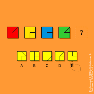
 The first puzzle my roommate and I completed can be found here: http://www.puzzles.com/PuzzlePlayground/NextSquare/NextSquare.htm

My attempt:
 Roommate's attempt:

When solving these puzzles my roommate completed his almost right away while it took me a couple minutes to solve and I didn't even end up being correct. My method at solving this puzzle was to use pattern seeking. I tried to find some pattern between the squares and what I came up with was that the first and third box had one line and the second and fourth had two lines so I figured that the question mark box ha to be C considering the fact that it was the only answer box with one line. This didn't seem like a very likely pattern, but I couldn't figure out anything else that seemed to work. My roommate on the other hand got his answer right away because he looked at the overall picture first. He noticed that the lines in each square actually made up a number and each box was the next number; 1, 2, 3, 4, 5. In this way he was using from another viewpoint because numbers are not normally seen in this way. He also used pattern completion because he saw the number pattern and was able to complete it successfully.

 The second puzzle my roommate and I completed can be found here:http://www.puzzles.com/PuzzlePlayground/ThreeBracelets/ThreeBracelets.htm

 My attempt:


Roommate's attempt:

With this puzzle both and me and my roommate finished around the same time and both of us got the correct answer. In my completion of the puzzle I used matching and rotation. I rotated the paper so I could look at all three circles from the same angle and noticed that one of the triangles was facing the wrong direction and therefore did not match. My roommate also used matching but his method was different. He started at the same shape on each figure and then moved his finger one by one to the next shape on all figures and realized that after doing this a few times one of the triangles was backwards.

Thursday, October 13, 2011

Visual Perception 2 / Feature Hierarchy

Source: http://www.skinniemagazine.com/articles/coachella-valley-music-arts-festival-announces-2010-line-up/


        The poster above relates to my area of study, Visual Communication Design, and my interests because I like designing posters and I also like attending the actual festival. The poster is for a festival called Coachella which takes place over three days in Indio, California. It relates to the feature channels in several ways as well. When looking at the image, the first thing your eyes are directed to are the words Coachella, Jay-Z, Muse, & Gorillaz because of the size of text. After reading each headliner the poster plans your eye movement to look at all the bands below. The smaller the text for each band represents the less of importance. The color of the poster represents that the event takes place in an outside setting far away from any city. The colors also give off a soothing, friendly feel. The three different sections of text represents grouping, for each section illustrates the different artists performing that day. The layout feature channel is also present and is being used to show the order of days and what each day includes.The poster as a whole is organized very well, and makes it very easy for the reader to make sense of what this event is all about and what will happen when. Even though this poster is professionally designed,I would love to have the opportunity to design a poster for this event to illustrate how I can use the feature channels in an even better way to get their message across.

Thursday, October 6, 2011

Visual Perception 1 / Top-Down Visual Processing

Source: http://knakmos.deviantart.com/art/Perception-23682233

My area of study is Visual Communication Design and it relates to this design because Visual Communication Design uses various play on words, whether it be in an advertisement or artistic creation, to give off certain meanings. The image above is an example of top-down visual processing because it is related to goal-biased attentional looking. At a first glance of the image one would first see a vast amount of random letters getting the overview of the design. However, after that first glance longer fixations occur and the image directs ones eye movements to the letters in red. A person's eye movements begin at the word "everything" and then go down to the word "is" and this patterns continues until the person reads the last word in red, "perception". The words are then linked together in a person's mind to say "everything is a matter of perception". Thus, the purpose or goal of this design is to direct one's eye movements from one red word to the next to get the overall message of the design.